Getting Started
Quick start
Section titled “Quick start”Add Svelte Tweakpane UI to your project:
npm install svelte-tweakpane-uiImport and use Tweakpane components in your .svelte files:
<script lang="ts">  import { Button } from 'svelte-tweakpane-ui'</script>
<Button on:click={() => alert('🎛️')} />
Step by step
Section titled “Step by step”Step 0: Create a new Svelte project
Section titled “Step 0: Create a new Svelte project”If you’re starting completely from scratch and just want to test out the Svelte Tweakpane UI library, you can spin up a SvelteKit project like this — otherwise, skip to step 1.
Of course you can use Svelte Tweakpane UI anywhere Svelte works, including island frameworks like Astro or Eleventy (albeit with a caveat or two).
Create a new SvelteKit project using Svelte’s sv CLI tool:
npx sv create --no-add-ons --types ts --template minimal --install npm svelte-tweakpane-sandboxMove into the project directory for the following steps:
cd svelte-tweakpane-sandboxStep 1: Add Svelte Tweakpane UI to your project
Section titled “Step 1: Add Svelte Tweakpane UI to your project”From the root of your project, run:
npm install svelte-tweakpane-uiStep 2: Import and use Tweakpane components
Section titled “Step 2: Import and use Tweakpane components”If you’re starting from an empty SvelteKit starter project, you can add a button to the default +page.svelte route like this:
 <script lang="ts"> import { Button } from 'svelte-tweakpane-ui'; </script>
<h1>Welcome to SvelteKit</h1><p>Visit <a href="https://svelte.dev/docs/kit">svelte.dev/docs/kit</a> to read the documentation</p> <Button on:click={() => alert('🎛️')} />
Then run the project:
npm run dev -- --openAnd you should see:
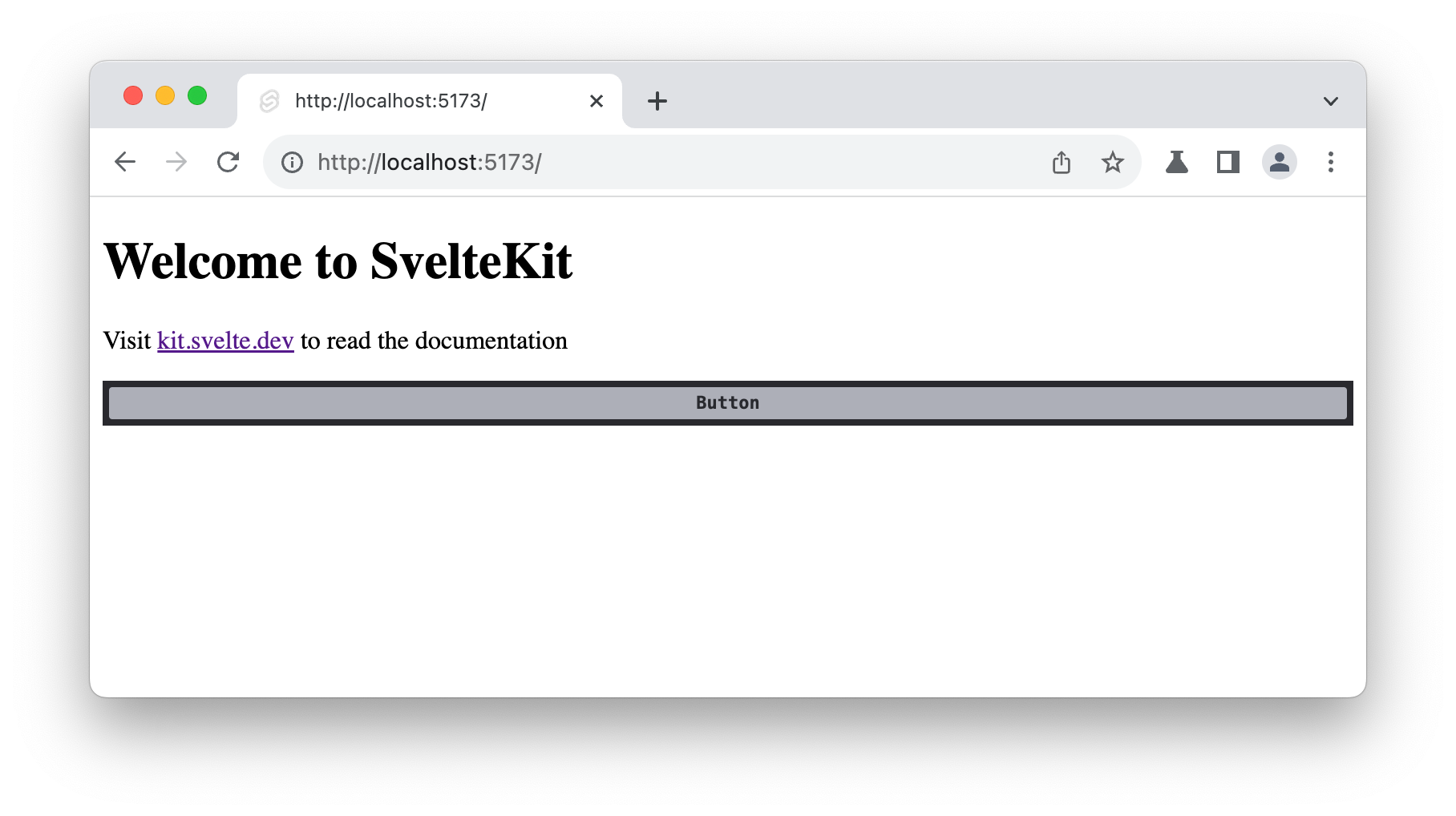
You’ll notice a few things right away if you’re familiar with Tweakpane:
-
The button is in the regular page flow, not fixed in the top-right corner?
By default, Svelte Tweakpane UI components are added to the document flow, which makes them easy to integrate with your existing UI and to manipulate with Svelte’s template syntax. You can change this by wrapping your components in a
<Pane>component and setting thepositionprop to'draggable'or'fixed'. -
I didn’t have to create a pane around the
Button?Svelte Tweakpane UI components “bootstrap” themselves into a title-less Pane component if they’re used on their own. This is a convenience feature, but you can also wrap them in a
<Pane>component yourself if you want to customize the title or other Pane properties. -
That’s a really wide button…
Yes, inline Svelte Tweakpane UI components take the width of their container. You can use a
<Pane>element to set a specific width, or nestle the component in an existing element with a defined width. -
Looks pretty straightforward, there’s nothing weird about the
on:clicksyntax…Exactly, Svelte Tweakpane UI components are designed to leverage as many Svelte conventions as possible. Behind the scenes, the lifecycle and event listeners of the underlying vanilla JS Tweakpane components are managed for you.